.jpg)
Number of heads
- Jan 16, 2013
- 2 min read
(Originally posted on January 16, 2013

I recently came across an antique drawing manual which touched on the proportions of the human body. The following illustration helped to explain a figure’s height by the number of “heads” it added up to. The lady on the left, slightly short perhaps, but with a noble bearing reminds me of a formidable great-aunt whose fearsome eye demanded impeccable manners from the impressionable and bashful adolescent that I once was. The tall elegant young lady on the far right reminds me of the grand-daughter who accompanied her, whose dazzling beauty, as she stooped to embrace me, left me crimson with embarrassment and brimming with admiration. Aside from these recollections, I thought the theme of human proportions worth exploring.

Some artists can become engrossed by the idea of proportions in the human body or the perfect figure. The canon or treatise of Polycleitus and the writings of Vitruvius did much to fuel this artistic desire for the perfect form. Leonardo da Vinci had an obsession with human proportions – his notebooks have many illustrations showing the ratios of various parts of the bodies to each other. His version of Vitruvian man (there are many) is the best known.
I feel that a higher ratio of heads to figure lends admirable elegance to a figure (which is probably one of the reasons women wear high heels – at least, it is rarely a question of comfort). Some artists are well aware of this and purposely lengthen the figure in a portrait.
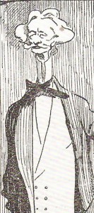
Sargent was one to exagerate the height of his subjects (see the following pictures). Indeed some of the portraits are so elongated they appear caricatural. If such was the case then a few jokers appear to have had a grand time caricaturing these caricatures (see below again). I am sure that Sargent’s distortions were deliberate but why were they so pronounced? Was he mischievous or an outrageous flatterer? He leaves me wondering. Here are Mr and Mrs I N Phelps Stokes by Sargent (and as caricatured by Montgomery Flag).


Coventry Patmore by Sargent (and as reproduced by Punch magazine)


At my art school when painting a standing figure, we were to told to stand well back from the model (three times the height of the model was the minimum distance) in order to keep the figure looking correctly proportioned. Because we painted sightsize and therefore standing up, anything less would lead to foreshortening of the legs as they would be viewed from a much higher angle than the head or torso and the resulting figure might end up stumpy legged. Also, to reduce the foreshortening effect it was better to place the model on a pedestal. It was all sound advice.
My great-aunt retained her noble bearing to the end but got smaller in old age and so moved further and further away from the ideal standard of proportion I had seen in her grand-daughter. The grand-daughter is as admirable as ever but there is just a little more of her.
Comments